Top 10 UX Mistakes Fintech Apps Make (and How to Fix Them)

Fintech apps live or die on user trust. If an experience feels confusing or unsafe, people close the app and rarely return.
When onboarding drags, dashboards overwhelm, or fees are unclear, frustration sets in. That frustration drives churn, increases support load, and hurts brand credibility. With money on the line, users leave even faster.
The good news is that these problems are avoidable. This guide highlights the 10 most impactful UX mistakes in fintech apps and shows how to fix them so your product builds trust, keeps users engaged, and drives growth.
1. Bad Onboarding Process
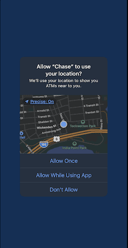
Chase asks for your location right away, before you even get a chance to interact with the app.
Main Pain Points | |
|
|
Why It’s a Problem
Complicated onboarding directly impacts adoption and revenue. People won’t stick around if they get confused right from the start.
High drop-off risk: Every extra field, screen, or delay makes users more likely to abandon before finishing.
Trust erosion: Fintech users are cautious with personal and financial data. A drawn-out process feels risky and discourages sign-ups.
Mobile friction: On smaller screens, long text blocks, cluttered steps, and repetitive flows are magnified—slowing users down when they expect speed.
The result: churn before activation and fewer users ever reaching your app’s core value.
How to Fix It
The goal is to reduce friction while building trust.
Start with a streamlined flow, then enhance the experience with these steps:
- Simplify and prioritize. Collect only essential information upfront. Move secondary data requests to later interactions.
- Guide in small, meaningful steps. Break flows into short actions that highlight value instead of overwhelming with features.
- Let users skip or explore. Offer “skip for now” options so users can reach your app’s value immediately if they prefer.
- Personalize the path. Tailor onboarding by asking about goals or intent early, then show the most relevant features first.
2. Using Jargon and Complex Language
Users just want to clearly understand what your app is telling them. (Example made in Claude)
Main Pain Points | |
|
|
Why It’s a Problem
Fintech is already complex. When an app throws industry jargon, vague labels, or text-heavy explanations at new users, it magnifies that complexity. Instead of feeling empowered, people feel lost or even distrustful.
Think about it: “Enable multifactor authentication to mitigate account takeover” is far less effective than “Add extra login protection.” Clear, direct wording reduces hesitation and keeps users moving forward.
Good UX writing is not the same as marketing copy. While marketing aims to sell, UX writing aims to guide. The best microcopy makes complex processes—like payments, transfers, or KYC checks—feel simple and intuitive. Without it, you risk high drop-off rates, user errors, and lower trust in your product.
How to Fix It
The solution is better UX writing practices embedded into your design process:
- Write for clarity, not finance experts. Replace jargon with plain, everyday language. For example: “Transfer complete” instead of “Funds disbursed.”
Keep copy short and scannable. Headings, clear buttons, and simple labels help users act without hesitation. If your team does not have a dedicated UX writer, ensure designers or product managers follow UX writing guidelines consistently.
- Test with real users. Watch where people hesitate or get confused. If a button or instruction slows them down, rewrite it.
Good UX writing becomes invisible. It guides people through tasks smoothly, helping them focus on using the app rather than interpreting it.
3. Hidden or Confusing Fees
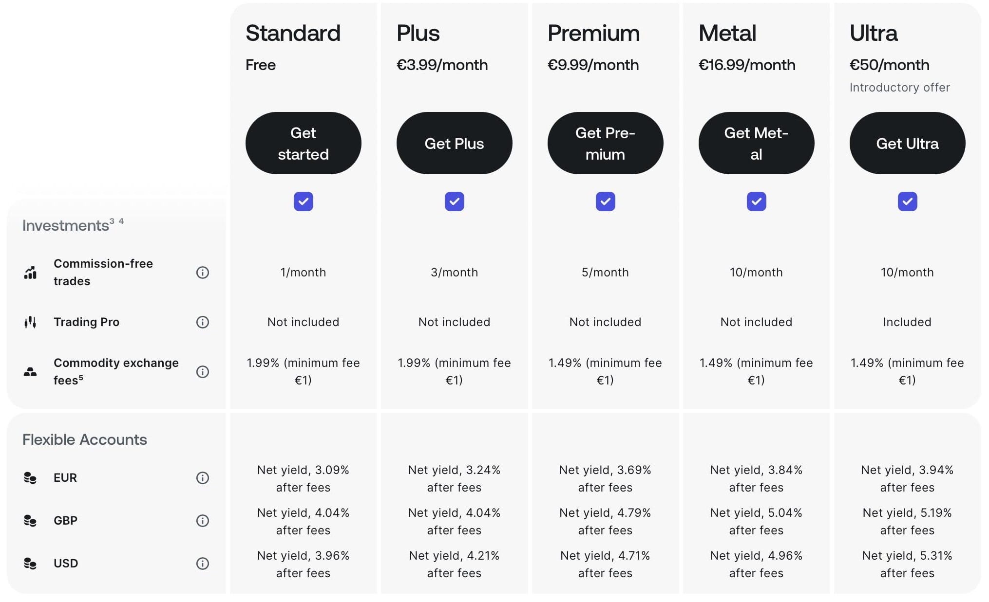
Revolut makes fees clear and easy to compare across plans. (Source: revolut.com)
Main Pain Points | |
|
|
Why It’s a Problem
What feels like a small fee (say, a 1% instant transfer) quickly snowballs for frequent users. Add in surprise subscription charges, inactivity fees, or paywalls that only appear after sign-up, and frustration grows.
For many, the problem isn’t the fee itself. It’s the lack of clarity. If users don’t know what they’re paying for, or worse, feel tricked into paying, they’ll churn and likely share their negative experience publicly. In finance, confusion equals distrust, and once trust is lost, users rarely return.
Fintech apps succeed when they feel safe, fair, and transparent. Hidden or confusing fees undermine that instantly.
How to Fix It
Transparency, transparency, and even more transparency:
- Make fees visible upfront. Don’t hide them in fine print; show costs clearly before users take action.
- Use plain language. Replace “expedited disbursement fee” with “Instant transfer: $2.00.”
- Provide options. Let users choose between free slower services and paid faster ones with clear labels.
- Highlight free vs. paid tiers. Make it obvious what’s included in free accounts and what’s behind a subscription.
- Test for clarity. If a user can’t explain your fee structure in a sentence, rewrite it.
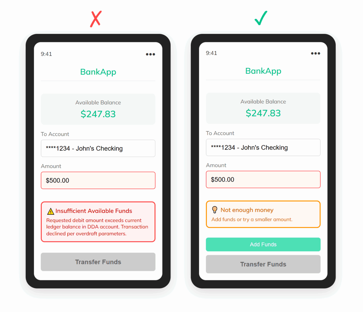
4. Poor Error Handling
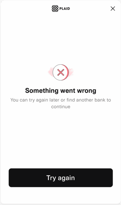
Ok, Plaid… but what exactly went wrong?* (Source: plaid.com)
*To be fair to Plaid, they do provide a more detailed explanation of this error in their help center.
Main Pain Points | |
|
|
Why It’s a Problem
When users see a generic “Something went wrong,” they do not know if:
- Their money is safe
- The issue is temporary
- They need to take a different action
This lack of clarity creates anxiety, especially in financial contexts where even small glitches can make people fear for their money. Poor error handling erodes confidence in the app and often results in abandoned sessions or unnecessary support tickets.
Errors in fintech apps are inevitable. Payments can fail, connections can drop, and banks may time out. What matters most is how the app handles those failures.
How to Fix It
Start with reassurance, then give clarity and a clear next step. Handled well, even an error message can make your app feel more trustworthy.
Confirming safety should come first. Tell users clearly when funds, data, or accounts are unaffected. This reduces anxiety before they even read the rest of the message.
- Explain the issue simply. For example: “We could not connect to your bank right now.”
- Offer recovery paths. Suggest what to do next, such as “Try again in a few minutes” or “Use another payment method.”
Finally, keep the user in control. Let them retry immediately instead of forcing them to restart the process from the beginning. That small detail signals respect for their time and effort.
5. Weak Trust Signals

Main Pain Points | |
|
|
Why It’s a Problem
Trust is the foundation of fintech apps. Without it, even the best features will fail to convert or retain users.
When an app does not clearly communicate how it protects accounts and transactions, users hesitate. Missing elements such as a lock icon during login, a security explanation at onboarding, or recognizable compliance badges create doubt. Outdated design makes the issue worse, because poor aesthetics are often associated with weak security.
If people feel unsafe, they abandon the app long before they ever complete a transaction.
How to Fix It
Show, do not just tell, that your app is safe. By signaling trust at every step, you reduce hesitation and make users more confident in moving money through your app:
- Add visible security cues. Features like biometric login, MFA, and encryption icons immediately reassure users.
- Explain protection clearly. Use short statements such as “Your data is encrypted and never shared.”
- Show legitimacy. Display regulatory compliance badges (PCI DSS, GDPR, etc.) and make company information easy to find.
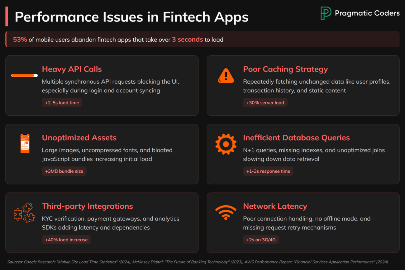
6. Slow Load Times and Lag
Main Pain Points | |
|
|
Why It’s a Problem
Performance is part of user experience. A fintech app that lags during payments, logins, or account updates instantly erodes confidence.
In financial contexts, even a short delay feels high-stakes. If a payment confirmation takes fifteen seconds, users start to worry: Did it go through? Is my money safe? This anxiety leads to abandoned transactions, repeated actions that cause errors, and eventually churn.
A sluggish app also harms your brand perception. People equate speed with professionalism and security. If your competitors feel faster, users will quickly switch.
How to Fix It
Treat app speed as a core UX feature. A fast, responsive app feels safer and more trustworthy, which directly increases retention and conversion.
Here are five practical ways to make performance a design priority:
- Benchmark performance. Aim for sub-two-second load times on key actions like login, transfers, and payments.
- Give clear feedback. Always show loading states, progress indicators, or confirmations to reassure users.
- Prioritize critical flows. Optimize speed for transactions and account checks first, then refine less frequent tasks.
- Review regularly. Monitor performance data, identify bottlenecks, and continuously improve.
7. Too Many Steps for Transactions
Main Pain Points | |
|
|
Why It’s a Problem
Users expect financial transactions to be quick and seamless. When apps insert unnecessary steps (extra confirmations, repeated logins, redundant data entry), they frustrate users and increase drop-off rates.
Security is often the justification, but poorly designed security flows can feel more like obstacles than protection. Instead of reassuring users, they create doubt and impatience. In fintech, that impatience is costly: it means abandoned payments, fewer completed transactions, and lower trust in the app’s overall usability.
How to Fix It
Start by removing unnecessary steps. Every extra confirmation screen adds friction, so focus on making the flow as short as possible.
- Replace repeated logins with biometric or session-based authentication. This keeps security strong without frustrating users.
- Use clear progress indicators to reassure people that they are nearly done.
Beyond design changes, you should test transactions with real users. Watching where people slow down or quit is the fastest way to uncover hidden friction.
8. Cluttered Dashboards

What works for Alipay in China feels overwhelming in Western markets. (Source: Alipay)
Main Pain Points | |
|
|
Why It’s a Problem
Dashboards are meant to simplify complex information, yet many fintech apps do the opposite. By trying to show every chart, number, and feature at once, they overwhelm users.
Unless you are targeting the Chinese market, clutter is a mistake. Super apps like WeChat or Alipay thrive on it because users there expect one app to handle dozens of tasks. That model does not translate well elsewhere. In Western markets, fintech users are far less forgiving. A dashboard packed with charts, menus, and numbers feels unprofessional, confusing, and harder to trust, especially when money is involved.
Overload creates choice paralysis. Faced with too many options, users hesitate or quit without acting. Research on decision fatigue shows that more choices often lead to less action, not more.
How to Fix It
A dashboard should guide users to what matters most, not drown them in data.
Prioritize essential actions. Make balance checks and transfers instantly accessible, while pushing advanced features into secondary menus.
A cleaner hierarchy reduces noise and helps users feel in control. Instead of trying to showcase everything at once, let them uncover details only when they need them. This makes the dashboard feel lighter and more intuitive.
Use progressive disclosure. Reveal charts, reports, and advanced analytics gradually, keeping the initial view focused and approachable.
A design that balances clarity with depth reassures users and strengthens their trust in the app.
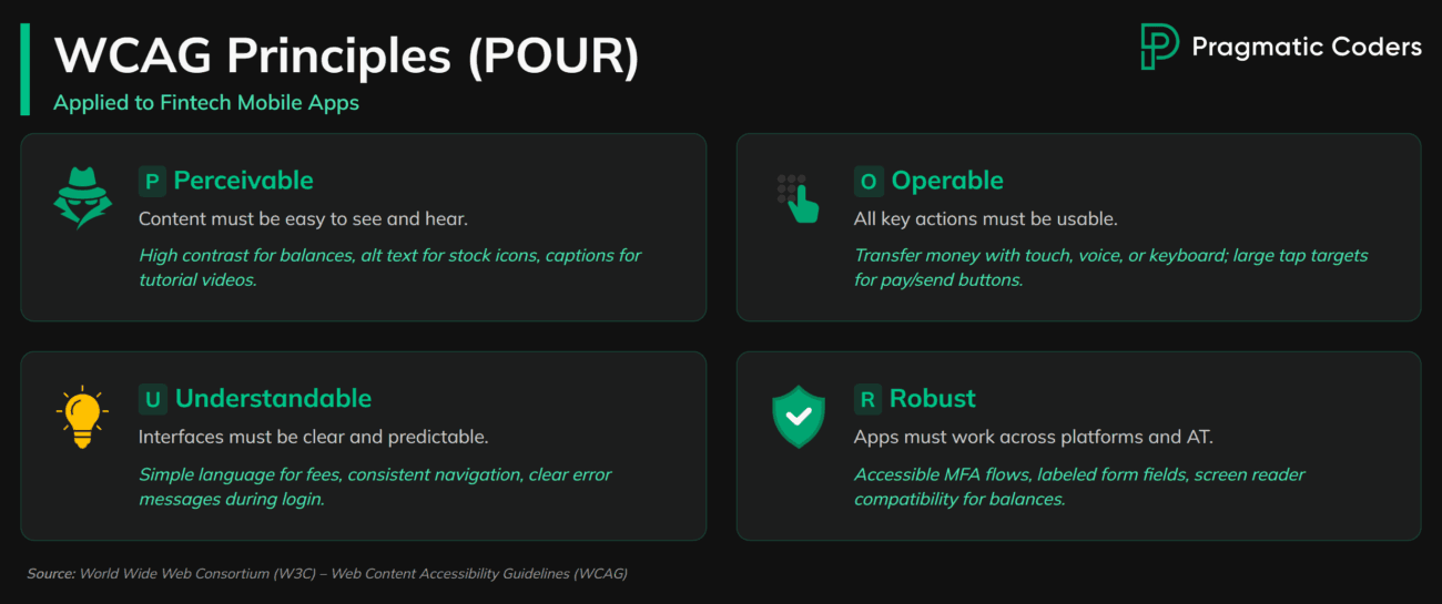
9. Ignoring Accessibility
Main Pain Points | |
|
|
Why It’s a Problem
Ignoring accessibility locks out millions of potential users and can put your company at legal risk. Fintech apps are often used by people with vision, hearing, or motor challenges. If they cannot interact with your product, they will leave. In many markets, you may also face compliance penalties.
Standards like WCAG (Web Content Accessibility Guidelines) and laws such as the ADA (Americans with Disabilities Act) or EN 301 549 (based on WCAG) in the EU set clear expectations for mobile app accessibility. Failing to meet them excludes users and exposes your business to fines or lawsuits.
At its core, poor accessibility is bad UX. If people cannot tap a button, understand the text, or use assistive technology, the experience fails—no matter how polished the design looks.
How to Fix It
Accessibility must be designed in from the start, not bolted on later.
- Follow WCAG principles. Ensure text has enough color contrast, tap targets are large enough, and navigation is logical.
- Support assistive technologies. Make sure screen readers work properly, labels are descriptive, and common actions have accessible alternatives.
By aligning your fintech app with accessibility standards, you expand your audience, reduce compliance risk, and create an inclusive product that earns long-term trust. Also, accessibility testing should be part of QA. Test with real users who rely on assistive tech to uncover issues that automated tools miss.
10. One-Size-Fits-All Experience
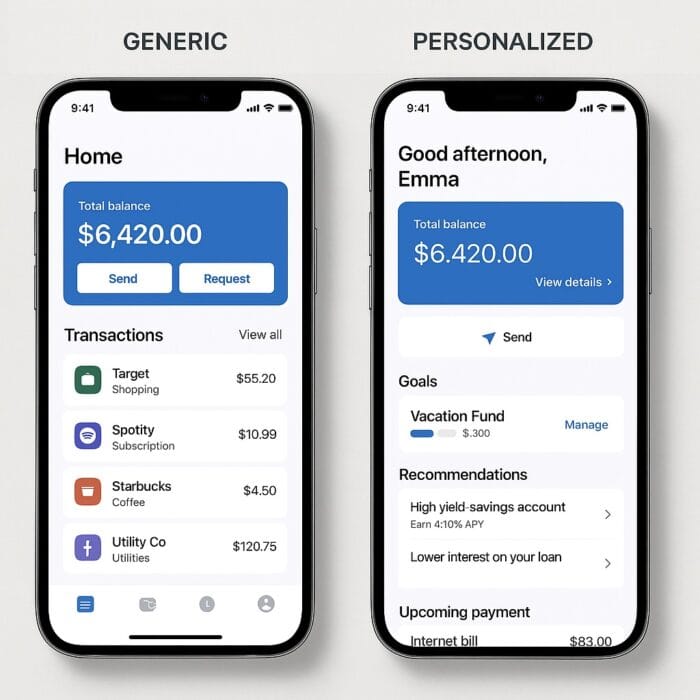
Even small touches of personalization go a long way in fintech apps. (Mockups created with AI tools)
Main Pain Points | |
|
|
Why It’s a Problem
Fintech users have very different needs. A student opening their first digital wallet does not want the same experience as a professional investor, yet many apps treat them as if they do. Generic onboarding, uniform dashboards, and identical feature sets create friction for some and boredom for others.
Today’s users expect personalization by default. Streaming, e-commerce, and even food delivery apps adapt quickly to individual preferences. If your fintech app does not, it will feel outdated. Worse, irrelevant flows waste time and drive users away.
The opportunity is in hyper-personalization, using data and behavior to tailor experiences at scale. Done right, it makes every user feel like the app was built for them, improving both engagement and trust.
How to Fix It
Start with segmentation, then go deeper.
- Offer self-identification. Let users choose their goals at onboarding—saving, investing, or budgeting—and shape the journey around that choice.
- Personalize dashboards. Surface the most relevant actions and data based on behavior, while allowing customization for power users.
Beyond basic segmentation, explore hyper-personalization techniques. Leverage user data, AI, and predictive analytics to anticipate needs and deliver the right features at the right time.
How We Can Help
Strong UX is what makes fintech apps win trust and keep users. Our designers specialize in UX design services for fintech, crafting experiences that make digital products clear, intuitive, and customer-focused.
We begin with UX research to uncover what your users really need, then move into prototyping and testing to validate ideas early. Finally, we deliver visual design that is not only polished but also grounded in usability.
If you are building or improving a fintech app, our specialists can help you reduce risk, accelerate delivery, and create experiences users actually enjoy.
Conclusion
Fintech users want speed, clarity, and confidence when handling money. If your app frustrates them with hidden fees, cluttered dashboards, or confusing onboarding, they will leave.
The fixes are not complicated: simplify flows, write in plain language, test with real users, and design for trust. Apps that get these basics right win long-term adoption and loyalty.