What is UX writing? A short guide for business owners

Welcome to Industry Insights, where our software experts share deep industry wisdom.
UX design is a multifaceted field encompassing user research, information architecture, wireframing, visual design, and more. One crucial yet often overlooked aspect is UX writing, which guides users seamlessly through a product. In this article, I’ll delve into what UX writing is, how it can enhance your product, how to incorporate your brand voice, and share practical tips and research practices to elevate your UX writing.
1. What is UX writing?
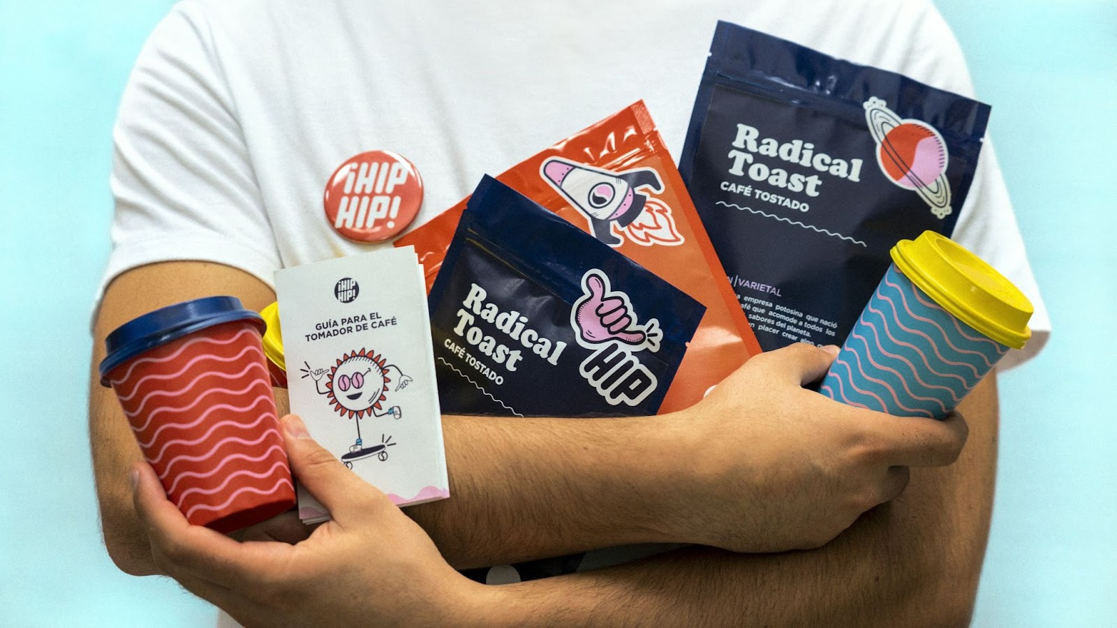
UX writing is the art of crafting the texts that appear throughout the interface of digital products. It is meant to give users the most natural and fluid experience, by reducing cognitive load required to understand available actions and provided information. Take a look at a copy (often called microcopy) in buttons, headers, notifications, and descriptions in your favorite app. A person wrote all of that with a lot of thought, so you can quickly scan and move across the interface. Interestingly, he term ‘UX writing’ only came into the spotlight in 2017, when Google introduced it at their Google I/O conference
In large organizations, the role of a UX writer is crucial. Take Booking.com, for example, where there’s one UX writer for every five or six designers. These writers work closely with design teams to create concise, effective copy. In smaller companies or startups, UX designers often wear multiple hats, taking on the responsibility of UX writing themselves.
It’s important not to confuse UX writers with copywriters, though. While both roles involve writing, their purposes are distinct. UX writers focus on guiding users through digital experiences with clear, functional text, collaborating closely with design and product teams. Copywriters, on the other hand, aim to create engaging, persuasive content for marketing, typically working within marketing teams. Their words are crafted to sell and captivate, whereas a UX writer’s words are designed to inform and direct.
2. How a great UX writing can help your product?

UX writing is not just about words; it’s about creating a connection with users on a human level. Imagine the rollercoaster of emotions people experience while using your product: the joy of receiving a certificate, the frustration of encountering an error. It’s the job of a UX writer to anticipate these feelings and craft messages that resonate. A simple “One moment please” can ease impatience, while “Don’t worry, we’ll never share your data with anyone” can build trust.
Good UX writing bridges the gap between humans and machines, making interactions feel more natural and less robotic. Instead of the cold “Error occurred,” imagine seeing “We’ve experienced trouble loading this page.” This human touch can make all the difference. Some products even introduce characters to guide users, adding a layer of personality and emotion. Think of Duolingo’s mascot, which exudes encouragement and enthusiasm, or Cleo’s AI, which offers witty, human-like messages in its roast and hype modes.
Tweaking the copy can be one of the simplest yet most effective ways to boost engagement and conversion. Users are more likely to click on call-to-action (CTA) buttons with two words or fewer compared to longer ones. Word choice matters immensely. When in doubt, A/B testing different versions of copy can reveal which resonates best with users, leading to higher engagement.
3. Brand voice
UX writing is a powerful tool for expressing your brand’s personality through its voice. Early on, think about the emotions you want people to associate with your product—should it feel friendly, formal, or perhaps a bit eccentric? Presenting a consistent brand persona can piggy-back on the psychological propensity to anthropomorphize (or see human characteristics in) everything. Remember, your brand is not just your logo, product, or marketing materials. It’s the gut feeling a person has about your product or organization. For instance, Innocent Smoothies has a cheeky brand voice, while Nike’s voice is inspiring.
What’s trending these days is backing away from the formalism to communicate authority in the industry, because today’s public is more skeptical and less trusting of authority. Experimenting with a variety of approaches can catch customer’s attention, build trust, sound relatable, and showcase the value in their service or product offering. Just remember to have a clear vision of what the strategy and your audience is, because standing out is always associated with a certain amount of risk.
If you’re unsure about your brand identity or feel your company needs a reset, consider conducting a workshop using the brand alignment framework exercise. In this workshop, your team will brainstorm adjectives that describe your culture, customers, voice, benefits, values, and x-factor. After voting on the best ones, you’ll end up with six core adjectives that encapsulate your brand’s essence, community, voice, benefits, values, and unique traits.
To develop your app’s voice, imagine it as a public personality, an object, or even a song. For example, in the Duolingo brand guidelines, they use the “If Duolingo were a…” exercise. If Duolingo were a celebrity, it would be Trevor Noah—funny, accessible, and smart. If it were a song, it would be “Don’t Stop Me Now,” which makes everyone feel good and inspired to do more.
It’s important not to confuse brand voice with tone of voice. Your brand voice is the overall personality of your brand, while the tone is the specific mood the personality takes on in different contexts. For example, when users are happy, the tone might be playful and cheeky; when they are frustrated, it should be respectful and concise.
Successful UX writing always considers the user: their environment, their journey so far, their future intentions, their mood, and their skill level. This is where tone mapping comes in handy. A tone map helps you select the right tone for different contexts.
To create a tone map, start by considering the key points in your user’s journey map. Next, choose two dimensions to represent your range (e.g., Fun-Serious and Concise-Detailed). Finally, plot each stage of the user journey onto the map.
For consistency in messaging, include the brand voice and tone guidelines in your style guide, complete with examples and a list of preferred and avoided words. This ensures everyone on your team can write in a way that aligns with your brand’s voice, creating a cohesive and engaging experience for your users.
4. Tips for great UX writing

Use conversational tone
Using a conversational tone can make your copy sound more human and less robotic. A friendly, conversational tone not only evokes positive emotions but also builds trust with your users. To achieve this, incorporate first and second-person pronouns, and use informal linking words like “anyway,” “well,” “plus,” and “of course”—just as you would in everyday conversation. Aim for a readability level between 5th and 8th grade to ensure that users can quickly and easily understand your content. Trying to impress readers with complex sentences and academic tone will result in a great sacrifices to readability and credibility. As research shows, even domain experts prefer plain language.
Be consistent
Consistent writing means using the same language style and structure across the entire interface. To achieve this, agree on formatting rules, terminology for key features, and whether to use the first or third person. For example, if you choose “my profile,” you should also use “my dashboard” instead of “your dashboard.” This uniformity ensures a cohesive user experience and clear communication.
Try to shorten your copy
When writing UX copy, keep sentences concise, as UI space is limited and longer sentences increase cognitive load. Start by jotting down the message you want to convey, then find ways to shorten it without losing clarity or your brand’s personality. Here are some tips:
- Focus on essential information by removing unnecessary details. For example: “In order to reset your password, please click on the link that has been sent to your email address.” becomes “Click the link in your email to reset your password.”
- Use contractions to make the text shorter and more conversational. “You are not authorized” becomes “You aren’t authorized.”
- Incorporate symbols and abbreviations where appropriate. “Number of items” becomes “# of items.”
- Omit articles when possible. “Click the save button” becomes “Click save.”
- Use command language for directness and clarity. “You can access your profile here” becomes “Access profile.”
- Merge steps into single, concise instructions. “To start, click on the file menu and then select new” becomes “File > New.”
While brevity is often beneficial, remember that shorter copy isn’t always better. Longer copy can provide more opportunities to address user objections, offer additional context, build trust, and convey tone of voice. The key is to justify every word and ensure there’s a good reason for any additional length.
Bend grammar conventions
Bending debatable grammar conventions is acceptable as long as it’s consistent and aligns with your brand voice. Here are some examples:
- Ending sentences with prepositions: “Tell us where you come from.”
- Splitting infinitives: “To boldly go where no one has gone before.”
- Using passive voice: “Your account has been updated.”
These stylistic choices can make your copy feel more natural and relatable, enhancing the user experience without sacrificing clarity.
Adapt to the user mood
When users are satisfied or pleased, your tone can be confident, enthusiastic, and even playful. Use exclamation marks, highlight benefits over functions, and infuse your copy with a sense of fun.
When users are neutral, adopt a warm and relatable tone. Get to the point quickly, use contractions, write as you speak, and place the most important information up front.
When users are unhappy—most commonly when they encounter an error—be concise and honest. Choose short, calm, and reassuring words. Be direct instead of passive; say “we made a mistake” instead of “a mistake was made.” Keep sentence structures simple, focusing on one point per sentence. Make your content even simpler than usual, as reading comprehension tends to decrease when people are anxious.
Use patterns
Using best practices for writing copy in common UI components and elements reduces cognitive load, helping users achieve their goals more efficiently. People expect websites to behave similarly to those they already know. By using familiar patterns and best practices, you decrease the learning curve, reducing frustration and increasing the likelihood that users will complete their tasks. Here’s how to apply these principles:
- Buttons: Button labels should be clear and contextual, indicating what happens or what users get when they click. For example, “Sign up” is more descriptive than the vague “Submit.” Links can be longer and more descriptive since they provide additional context.
- Errors and alerts: Error messages should clearly explain what happened in understandable terms, avoiding technical jargon and abbreviations. Never imply it’s the user’s fault; take the blame, apologize for the inconvenience, and guide the user to the next step.
- Labels: Labels are used for menus, tags, breadcrumbs, text input, and other interface elements. Keep labels short—ideally 3-4 words—to make them easier to scan and understand. Use verbs for actions and combine them with nouns for context (e.g., “edit” becomes “edit profile”). In navigation components, nouns can serve as signposts for actions that occur on different pages, such as “settings” or “support.”
- Notifications: Notifications should be useful and inform the user about the system’s status. Always question why the user needs this message and how it will help them. If action is required, be specific about what needs to be done.
- Forms: Form labels should be straightforward and informative, typically no longer than 2-3 words. If users might misinterpret field requirements, provide clear instructions. To avoid overwhelming users, consider displaying instructions in tooltips on hover or when the field is in focus. Injecting a bit of humor, if appropriate for your brand, can put users at ease when providing sensitive data and prevent mistakes due to stress.
- Placeholders: Placeholders should offer brief instructions or hints on what data users should enter. Since placeholders disappear when the cursor is placed inside a field, avoid putting essential information in them. Instead, position the label at the top of the input field.
- Tooltips: Tooltips provide additional information and should add value to the user experience. A good tooltip might describe an unlabeled button. Keep tooltips concise—up to 150 characters—and avoid including critical information.
Use progressive disclosure
Progressive disclosure is a technique that gradually reveals complex information and advanced options only when the user requests them. This approach simplifies and enhances the user experience by prioritizing relevant content, saving screen space, reducing cognitive load, and minimizing errors for both novice and experienced users. It’s particularly useful for information-rich websites and applications with numerous commands, features, and options that might overwhelm new users.
By implementing progressive disclosure, you ensure that users are not bombarded with too much information at once. Instead, they can focus on completing their tasks with the necessary tools and information readily available, while advanced features remain accessible but unobtrusive.
Consider using progressive disclosure in your designs to create a more intuitive and user-friendly interface, especially in complex applications where ease of use is paramount.
Avoid dark patterns
Dark patterns refer to a set of manipulative design practices that exploit psychological principles to trick users into actions they didn’t intend to take, such as subscribing to a newsletter. While these tactics might offer short-term gains, they ultimately undermine long-term user trust and loyalty. By triggering and manipulating emotions, dark patterns can make people feel sad, unfortunate, or helpless, prompting them to seek immediate relief. An example might be a message saying, “If you unsubscribe, a cute cat will die,” preying on users’ empathy to prevent them from opting out.
Another common tactic is to evoke feelings of shame or fear of missing out (FOMO) when users attempt to unsubscribe or delete their accounts. Additionally, dark patterns often employ confusing language—using double negatives, passive voice, or vague terms—to increase cognitive load and frustrate users. This confusion can lead to mistakes, such as accidentally purchasing something or subscribing to services they don’t want. Although dark patterns might boost short-term metrics, they do so at the expense of user satisfaction and trust.
5. Testing UX copy

Copy can be tested using various design testing methods, but because words are open to interpretation, they often require a different approach. Here are some effective methods for testing UX copy:
Readability scores
Readability scores measure the complexity of words and sentence structures in content. Typically calculated by a computer, these scores are expressed as years of formal education required to understand the text. Numerous online tools, such as readable.com, hemingwayapp.com, and thewriter.com use different readability formulas to provide these scores.
Cloze testing
Cloze testing checks if the copy is comprehensible and conveys the intended meaning. In this test, a moderator replaces certain words in the text with blanks and asks users to fill in the gaps. The comprehensibility of the copy is determined by the percentage of correctly guessed words (including synonyms and minor misspellings). A score of 60% or higher indicates good comprehension.
Comprehension survey
A comprehension survey assesses how well users understand a piece of content. Participants read the content and answer related questions. This method provides valuable insights but can be time-consuming and costly. For a budget-friendly option, consider an unmoderated survey where participants receive a link to an online questionnaire.
Highlighter test
The highlighter test evaluates the emotions that microcopy evokes. Participants highlight words that make them feel safe and confident in green, and words that cause anxiety or insecurity in red. Additional colors can represent other emotions. Like the comprehension survey, this can be done on a budget by sending participants an online document to highlight.
A/B testing
If your site is live, A/B testing can be highly informative, especially for copy related to calls-to-action (CTAs). By comparing the conversion rates of different versions, you can determine which copy performs better.
Quick exposure test
This test mimics real-life conditions by displaying a screen for just five seconds before asking questions about its content. It reveals what users notice and remember, providing honest feedback on the effectiveness of your copy.
Using Google Trends
When deciding between different word choices, Google Trends can help you compare the frequency of search queries for each term. This insight helps you understand your target audience’s preferences.
Competitor analysis
Competitor analysis is common but often overlooked from a UX writing perspective. Create a spreadsheet to compare criteria like tone, voice, readability, and sentence structure across 3-5 competing companies. This analysis provides insights into your competitors’ approaches, but avoid blindly copying their solutions as they may not have been thoroughly tested or suited to your brand.
Conversational research
Analyze where your target audience gathers, such as social media, forums, and app store reviews. If your product is live, examine comments on your posts. This research helps you understand the vocabulary and terminology your users prefer.
Observational research
Visit your users in their natural environment, like a teachers’ lounge if you’re developing an app for teachers. Observing their behavior and conversations provides unique insights that can inform your UX copy.
6. Documentation in UX writing
As with any documentation, the sooner you start UX Writing documentation, the better. This ensures that no important insights, feedback, or key decisions get lost. Start with the basics that will be immediately helpful for your team, like how to write the date, whether to capitalise feature names, or whether to use title case or sentence case. Don’t think too much about the format of documentation, as you can adapt it over time.
Documenting UX writing under cohesive and helpful labels in a dedicated document is crucial. This approach facilitates the reuse of components and the development of new copy. Ideally, each piece of copy should be supported with in-use examples from your own or competitors’ products.
To further enhance the utility of your documentation, include style guidelines and background information such as user personas. This ensures that everyone evaluates the copy from the same perspective, promoting consistency and clarity across the team.
7. Good UX writing. Summary
UX writing is an essential component of effective UX design. By crafting clear, concise, and engaging microcopy, you can significantly enhance the user experience, build trust, and convey your brand’s personality. Remember to focus on your users’ needs, adapt your tone based on their emotions, and utilize best practices to reduce cognitive load. Whether you’re working on buttons, labels, or error messages, thoughtful UX writing can transform how users interact with your product. Keep experimenting, learning, and refining your approach to ensure your copy resonates with users and helps them navigate your digital landscapes effortlessly.