Revenue, listening minutes, and a question about God. Which product metrics really show that a product is moving in the right direction
I asked Senior Product Managers at Pragmatic Coders:
“Which metrics are worth measuring to know that a product is moving in the right direction?”
The answers included revenue, listening minutes, booked nights, lagging indicators, data quality, technical debt, and the question: “Do you want to talk about God?”
Does that sound like the start of a very chaotic conversation? Maybe. But the longer I read the answers, the more clearly I saw that there is a method in that madness. Measuring a product is not just about throwing a few impressive metrics onto a dashboard. Above all, it is about understanding what value really means in a given product, how to recognize that the user has received it, and how quickly we can tell whether what we are building is actually working.
Because in one product, the most important signal will be revenue. In another, it will be minutes spent listening to music. In yet another, it will be the number of nights booked, shorter process handling time, fewer errors, or a drop in manual work done outside the system.
Here are five different ways of looking at product metrics – each of them highlights a different aspect of the topic. Together, they form a practical framework we use at Pragmatic Coders when a client asks whether their product is heading in the right direction.
Key takeaways
- There is no universal set of product metrics. The value you need to measure is specific to the product and its stage of development.
- Most metrics that signal success (revenue, NPS, number of leads) are lagging indicators. They talk about the past. To steer day to day, you need a proxy metric that is strongly correlated with the business goal.
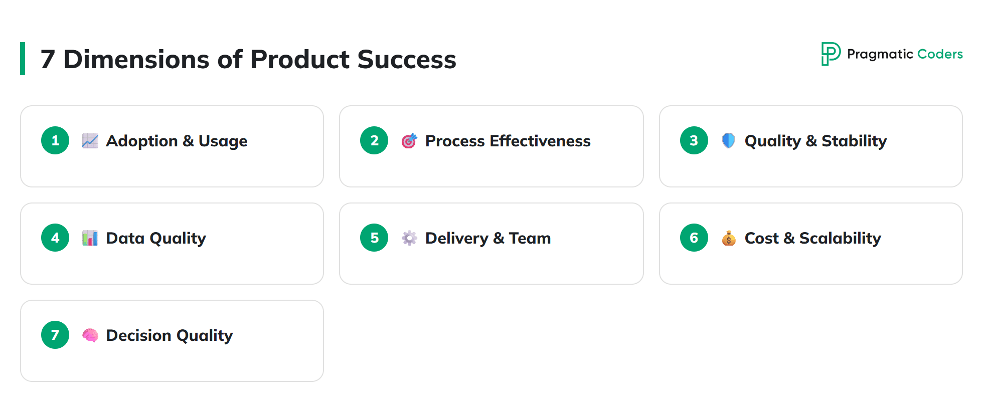
- It is worth measuring a product across seven dimensions in parallel: adoption, process effectiveness, quality and stability, data quality, delivery and predictability, cost and scalability, and the quality of product decisions.
- A good metric is one that tells the team what to do differently when it changes. Five relevant indicators beat a dashboard with forty.
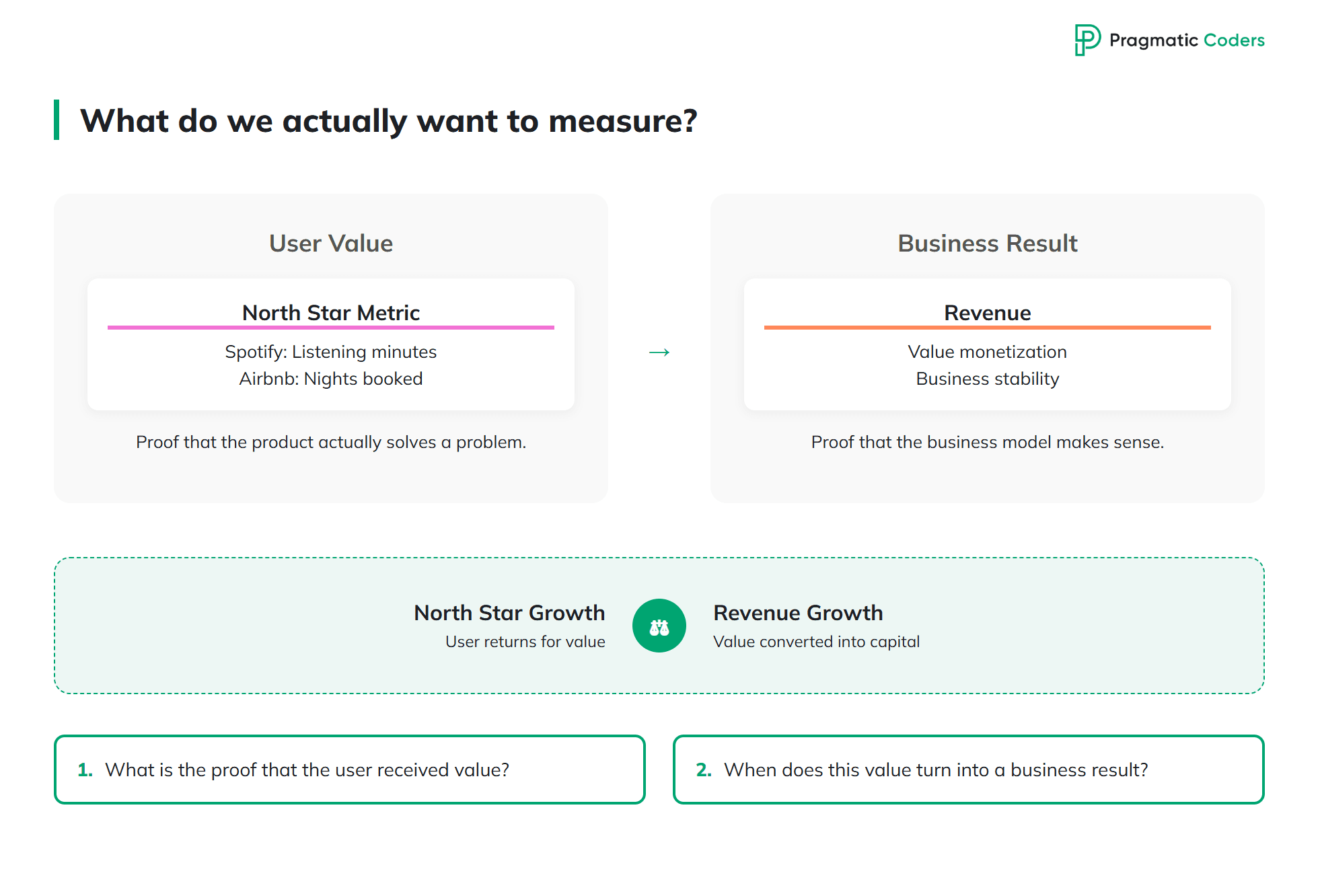
What exactly are we trying to measure? Define value first
The first answer to my question was short and, in a way, shut down the whole discussion about a “universal set of metrics.”
“I think it depends heavily on what kind of product it is. It depends on what proves that the user received value. For example, in Spotify it is minutes listened, in Airbnb – nights booked.”
- Darek Tarasek, Senior Product Manager at Pragmatic Coders
Each of those products has its own North Star Metric – one number that best captures the moment when the user has actually received value from the product. In Spotify, it is not the number of premium accounts or even logins, but time spent listening, because listening is what the user came for. In Airbnb, what matters is not page visits, but nights booked, because only a booking represents an exchange of value between the host, the guest, and the platform.
Wiktor rounds out that thought from the business side, and puts it much more bluntly.
“Revenue. In the end, that is what really shows whether the product makes sense.”
- Wiktor Żołnowski, CEO and co-founder of Pragmatic Coders
What Darek says and what Wiktor cares about do not contradict each other at all – they are simply two views of the same thing. The North Star Metric helps you check whether the user keeps coming back for value. Revenue shows whether that value can actually be turned into a sustainable business. If the North Star is going up and revenue is not, you probably have a monetization or value proposition problem. If revenue is growing but the North Star is falling, you are temporarily “buying” growth while weakening the foundation of the product, which will quickly show up in retention.
Before you choose any product metric, answer two questions:
- What in your product proves that the user received value?
- At what point does that value turn into a business outcome?
If you cannot answer each of them in one sentence, no metrics framework will save you.
Most key metrics are lagging indicators. Why you need a proxy metric
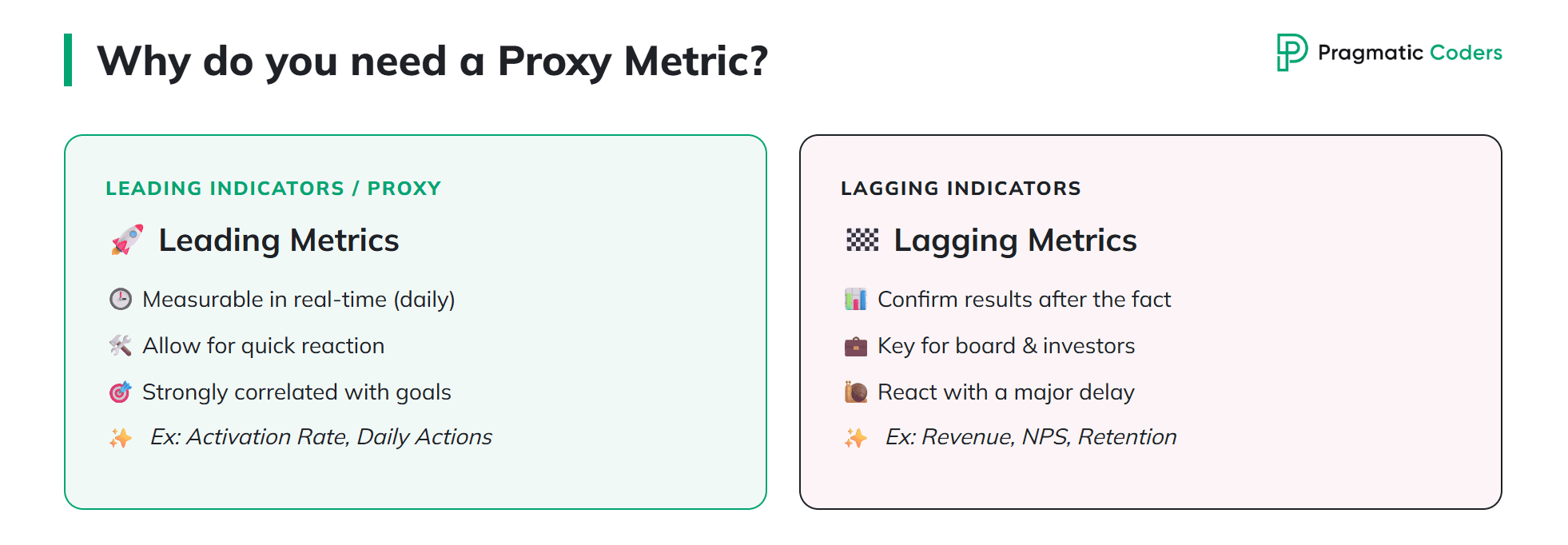
Here is the next problem: the metrics that best illustrate product success are usually not the right metrics for managing it in real time.
“In short – most often, the metric that shows product success is a lagging indicator. So measuring it on an ongoing basis does not really help. It confirms that things worked out, but by then you already know they worked out. Because the product has to make business sense – so, for example, revenue, the number of generated leads, or NPS are lagging metrics. They do not tell you much in real time, but if they are high, it means things are OK.”
- Bartek Czarnecki, Senior Product Manager at Pragmatic Coders
Lagging indicator – a delayed metric. It confirms the result after the fact. Examples: annual revenue, NPS, 12-month retention, number of contract renewals.
Leading indicator / proxy metric – an indirect metric strongly correlated with a lagging indicator, but measurable in real time. It lets you react before the result fully materializes. Examples: activation rate in the first 7 days, frequency of a key action during the week, time-to-value.
The classic example of this mechanism comes from Facebook.
“The most famous proxy metric: Facebook’s famous early proxy was getting a user to connect with 10 friends in 7 days. Getting 10 friends in 7 days is great to measure because you get results practically every day. Every day is a new cohort. You can monitor it and react quickly. And it turned out to be very strongly correlated with staying on the Facebook platform and with the company’s long-term goals.”
- Bartek Czarnecki, Senior Product Manager at Pragmatic Coders
This principle can be applied to almost any product. In B2B SaaS, a good proxy metric is often the number of users invited to a team in the first week, or the number of key actions completed before the trial period ends. In marketplaces, a typical metric will be the ratio of demand-side inquiries to the number of active suppliers in a given time frame. In operational products, it is worth measuring the percentage of processes handled end to end in the new system, without having to go back to Excel.
The best way to put it is this: for every lagging metric you show to the board, choose one proxy metric that the team can track continuously, ideally every day. If that proxy metric is moving in the right direction for two consecutive cohorts, the lagging metric will probably follow.
A product is not one number. 7 dimensions worth measuring in parallel
The most detailed answer to my question came from Krzysztof Pykosz. He starts with a strong claim:
“From my perspective, the most important thing is not to measure a product solely through the lens of ‘how many features we shipped.’ That is a common mistake. A product can keep gaining more functionality while at the same time solving the user’s real problem worse and worse, or generating ever higher maintenance costs.”
- Krzysztof Pykosz, Senior Product Manager at Pragmatic Coders
Good product metrics answer three questions:
- are users actually using the product in key processes,
- is the product improving a business or operational outcome,
- are we able to keep developing it in a stable way and without growing technical debt.
From those three questions, Krzysztof derives seven dimensions worth measuring in parallel.
1. Adoption and real usage. The percentage of key processes handled in the new system, the number of active users split by role, the share of users using new features, the number of cases where people still go back to Excel, the old system, or manual work. That last one is critical. If the product formally exists but operations have to work around it, adoption is only superficial, and the “feature shipped” metric says very little.
2. Process effectiveness. Process completion rate, number of operational errors, time to handle a single case, number of manual corrections, number of complaints, percentage of cases closed without support intervention. These metrics are closer to the business than to development. They show whether the system is actually improving how the organization operates.
3. Quality and stability. Number of production incidents, time to respond to and resolve incidents, number of hotfixes, number of regressions after releases. The most brutally honest metric in this category is the percentage of team time consumed by maintenance and firefighting. If a growing share of the sprint goes into fixes instead of progress, the product is not moving in the right direction, even if the roadmap looks ambitious.
4. Data quality. In many products, data is the product. It is worth measuring data completeness, the number of invalid records, the number of conflicts between sources, sync delays, failed imports, and the percentage of processes that require manual data correction. The lack of a single source of truth quickly increases development cost, error risk, and the number of operational problems.
5. Delivery and team predictability. Lead time, cycle time, throughput, the ratio of development work to maintenance work, WIP (how much work is started in parallel), time spent in individual statuses, sprint delivery predictability. These metrics help you spot the problem earlier. If tasks spend a long time in one status, WIP grows, and throughput falls, it usually means there is a problem with the process, dependencies, requirement quality, or architecture.
6. Cost and scalability. Monthly infrastructure cost, cost of handling a single transaction, latency, number of timeouts, degree of database utilization, ratio of maintenance costs to development costs. A product may keep gaining new features while simultaneously becoming more and more expensive and harder to maintain. These metrics help you notice that problem before it shows up in financial analysis.
7. Quality of product decisions. A category that is often overlooked. How many product hypotheses have been validated, how many features actually improved a measurable metric, how many did not deliver the expected result, how often decisions are made based on data rather than opinions, how quickly after release we are able to assess the effect of a change. Good product management is not about always being right, but about testing assumptions quickly and changing direction when the data says otherwise.
The product stage changes what is worth measuring
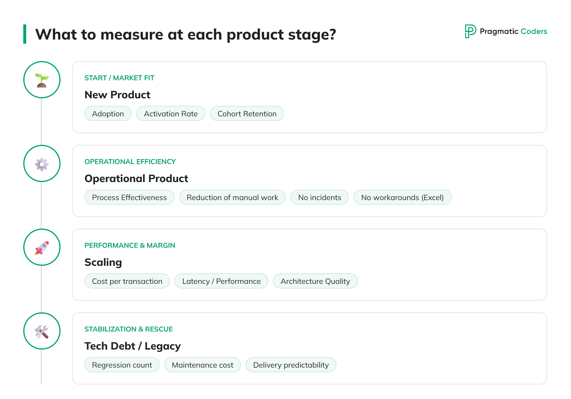
Those seven dimensions are not a checklist that you need to complete starting tomorrow. Their weight changes depending on the stage of the product.
- New product, fresh product-market fit. What matters most is adoption, activation rate, cohort retention, and validation of whether you are solving a real problem at all. Data quality and the unit cost of serving a single user or transaction are secondary, because the scale is still too small for them to be meaningful.
- Operational product supporting daily processes. What matters is stability, process effectiveness, and reducing manual work. Here, the biggest value is often what is not on the screen: no incidents, no manual corrections, no Excel workarounds.
- Scaling product. What matters is performance, unit transaction cost, and architecture quality. Revenue growth that doubles infrastructure cost is a trap you need to catch with cost metrics, not sales metrics.
- Product after an acquisition or burdened with heavy technical debt. What matters is the number of incidents, the number of regressions, maintenance cost, and delivery predictability. Until those metrics return to normal, talking about new features is premature – although at Pragmatic Coders, from day one of rescuing a product burdened with technical debt, we try to deliver new business value, not just fix the existing chaos.
In practice, most products are in more than one phase at the same time – for example, some functionality is mature while another part is still looking for product-market fit. In that case, you measure each part with a different set of indicators and do not try to force an average.
A good metric is one that tells you what to do differently
After reading the previous two sections, the temptation is obvious: build a dashboard with forty metrics and tick the box. That is a trap.
“My practical recommendation: do not build a dashboard with 40 metrics. It is better to choose a few indicators that really influence decisions. A good metric is one that tells the team what they should do differently when it changes.”
- Krzysztof Pykosz, Senior Product Manager at Pragmatic Coders
We believe that a healthy minimum set of product metrics covers five categories, with one, at most two metrics in each:
- Business. Does the product deliver financial value (for example MRR, margin, customer acquisition cost).
- Usage. Are people actually using it (North Star Metric, cohort retention, activation rate).
- Quality. Does it work reliably (number of incidents, resolution time, regressions).
- Delivery. Is the team delivering predictably (cycle time, throughput, ratio of development work to maintenance work).
- Tech and cost. Can the product be developed without growing debt (unit cost of operations, latency, share of maintenance work in the sprint).
It is better to have five key indicators that you regularly come back to than forty that nobody pays attention to. A dashboard should support decision-making, not create an illusion of control.
If you want to go deeper: the question about God
This brings us back to the opening of the article. When asked about metrics, Michał Kania replied like this.
“You might just as well start this conversation with… ‘Do you want to talk about God?’ It is a topic you could discuss forever.”
- Michał Kania, Senior Product Manager at Pragmatic Coders
Behind the joke there is a concrete list of sources worth drawing from if you want to treat product metrics seriously. Michał mentions some of them as the ones that shaped his way of thinking, and others as tools he uses in day-to-day work:
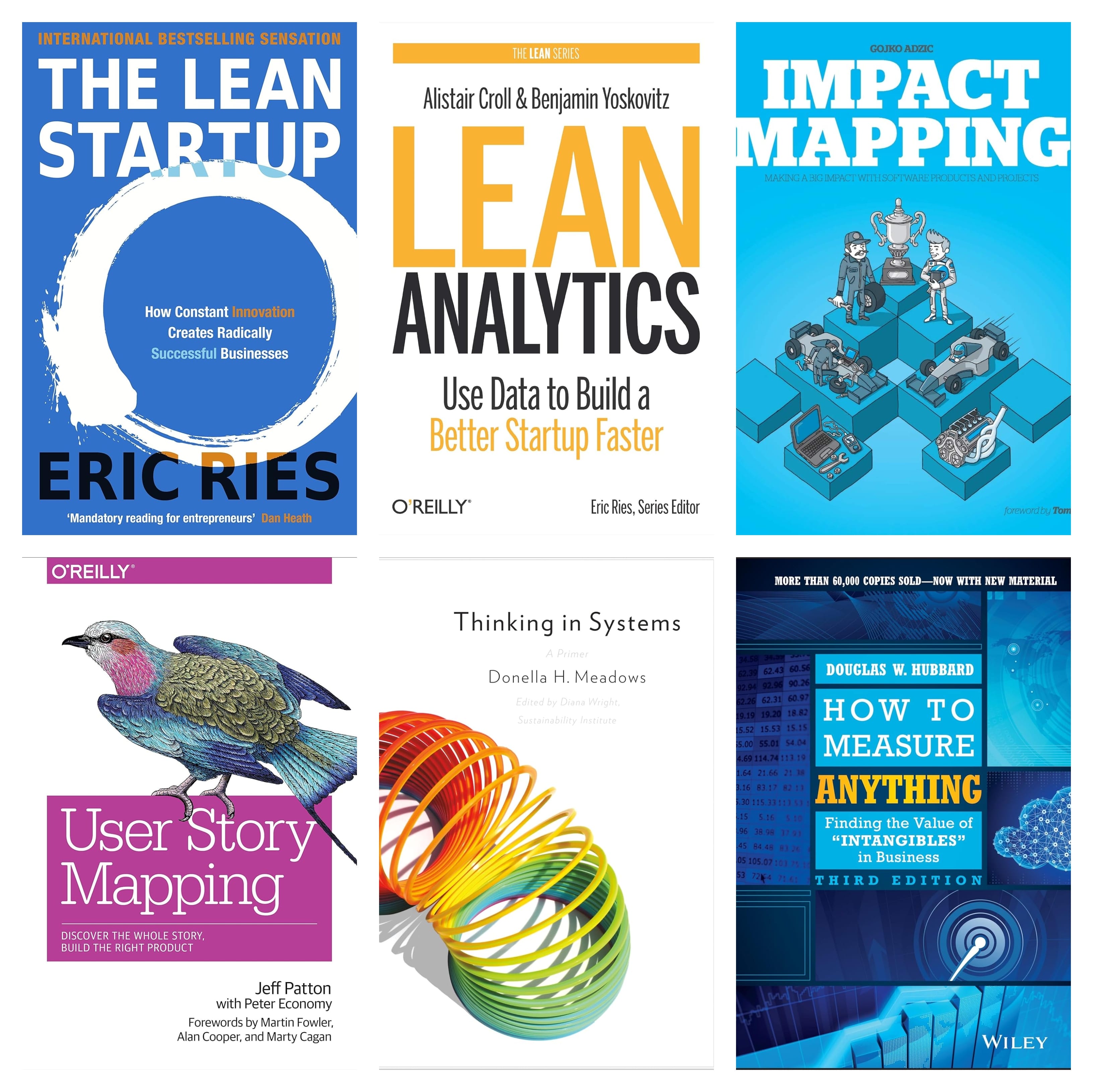
- Lean Startup Analytics (Eric Ries, Alistair Croll, and Ben Yoskovitz). Michał points directly to this approach as something that shaped the way he thinks about metrics. From this tradition come the distinction between vanity metrics and actionable metrics, as well as the concept of One Metric That Matters for a given product stage.
- Obeya – a visual management concept derived from the Toyota Production System (Japanese obeya, literally “big room”). It is a physical or digital space where the team keeps goals, key metrics, hypotheses, blockers, and decisions constantly in view. It forces a shared picture of the situation instead of five different dashboards for five different roles. Michał is currently using this approach in his own work.
- Impact Mapping by Gojko Adzic. It connects business goals with key people or groups (customers, users, the team), their behaviors, and specific outcomes in the product. This approach helps define the purpose of each metric clearly and tie it to goal delivery – so a metric does not hang in a vacuum “because everybody measures it.”
- Outcome from User Story Mapping (Jeff Patton, and in practice also Josh Seiden, Outcomes Over Output). An outcome is a measurable change in user behavior, not a delivered feature. Michał puts it directly: outcome = a change in behavior, for example “the user can do something faster.” And that “faster” is measurable – that is a good product metric.
- System Thinking (Donella Meadows, Russell Ackoff, Peter Senge). This helps you avoid the trap of optimizing one metric at the expense of the whole system. The classic example: average call handling time in a call center goes down because agents end the conversation before solving the customer’s problem. The metric goes up, the business goes down.
- “How to Measure Anything” by Douglas W. Hubbard. A practical argument that even things considered unmeasurable (user satisfaction, risk, strategic value) can be measured with a useful level of precision, as long as you clearly define what you actually want to know and what decision you will make based on that knowledge.
These are the frameworks we most often use at Pragmatic Coders when we design a set of metrics with a client for a new product or audit existing dashboards.
What ties these five perspectives together
Five people, five different perspectives – and five important questions that can genuinely help organize your thinking about metrics:
- What is value for our user? (Darek)
- How does that value turn into a business outcome? (Wiktor)
- Which proxy metric will tell us that we are moving in the right direction before the business result fully materializes? (Bartek)
The next issues appear more in Krzysztof’s and Michał’s comments – they relate to practical experience and the frameworks product leaders use:
- What stage is the product in, and which of those dimensions are the priority today? (Krzysztof)
- Which sources and frameworks are worth drawing inspiration from so you do not reinvent the wheel? (Michał)
By answering the first three questions for your own product, and then using ready-made frameworks and the tested perspectives of product leaders, you can turn the “chaos” from the beginning of the article into a concrete decision map – and use it continuously, not just from time to time.
Where to start in your own product
If, after reading this article, you want to check which areas of your product need the most improvement, at Pragmatic Coders we have prepared three free self-diagnosis tools – one for each of the three layers described above:
- Product Health Checklist (PHC 2.0) – the product layer. It audits product strategy, discovery, prioritization, and the quality of product decisions. It best addresses dimensions 1, 2, and 7 from Krzysztof’s framework (adoption, process effectiveness, quality of decisions).
- Scrum Health Checklist (SHC) – the delivery layer. It checks whether Scrum in your team actually delivers Transparency, Inspection, and Adaptation, or just rituals. It covers dimension 5 (delivery and team predictability).
- Technical Health Checklist (THC) – the engineering layer. It audits architecture, tests, CI/CD, observability, data, and security. It covers dimensions 3, 4, and 6 (quality and stability, data quality, cost and scalability).
Each checklist takes about 30 minutes and results in a prioritized list of concrete gaps to close.
If you feel that the problem does not end with metrics and goes deeper – into how work is organized on both sides of the project – we encourage you to check out our ebook 8 ways companies sabotage their own projects. The publication was created based on conversations with our Senior Product Managers, CTO, and Service Delivery Manager, and it focuses on common patterns of behavior that quietly weaken budgets and team motivation – often in ways that are hard to catch through product metrics alone.
Glossary of terms used in the article
Product metric – a measurable indicator showing whether the product delivers value to the user and the organization. A good product metric changes team decisions instead of just looking good in a presentation.
Lagging indicator – a metric that confirms the result after the fact. Revenue, NPS, 12-month retention, or contract renewals talk about the past, so they are not suitable for steering the product in real time, only for validating whether the strategy worked.
Leading indicator – a metric whose change comes before the change in a business indicator. It is strongly correlated with a lagging indicator, but measurable every day. It gives the team a reaction window counted in weeks, not quarters.
Proxy metric – an indirect indicator, not identical to the business goal, but strongly enough correlated with it that its movement predicts movement in the goal. The classic example: “10 friends in 7 days” as a proxy for retention at Facebook.
North Star Metric (NSM) – the one metric that best captures the moment when value is delivered to the user. In Spotify it is minutes listened, in Airbnb nights booked, and in B2B SaaS the number of key actions performed in a week by an active user.
Activation rate – the percentage of new users who complete a key action in a defined period that shows they experienced value (for example adding the first project, inviting the first team member, or completing onboarding).
Cohort retention – the percentage of users from a given cohort (for example those who registered in the same week) who are still actively using the product after N days, weeks, or months. The strongest signal of product-market fit.
Time-to-value (TTV) – the time it takes a new user to reach the first experience of value in the product. The shorter the TTV, the higher the activation rate and cohort retention.
Vanity metric – a metric that looks good in a report but does not change any decision (for example “number of website visits” or “total registrations since the dawn of time”). In Lean Startup, Eric Ries contrasts it with an actionable metric – one that reveals the cause and shows what to do differently.
Outcome (in product) – a measurable change in user behavior caused by a release, for example “the user performs X 40% faster.” The opposite of output, which is just the “delivered feature.”
Product hypothesis – a written assumption about what change in user behavior or business indicator a given implementation will produce. It includes a specific metric and direction of change, so after release it can be verified instead of debated as opinion.
Cycle time – the time from when work starts on a task to when it is released. Shorter cycle time means faster feedback loops and faster validation of product hypotheses.
Lead time – the time from when a need is identified (for example when a ticket is added to the backlog) to when it is released. It includes cycle time plus waiting time in the queue.
Throughput – the number of tasks completed by the team in a unit of time (for example per sprint). Together with cycle time, it gives a picture of delivery predictability.
WIP (Work in Progress) – the number of tasks started at the same time and not yet finished. High WIP usually correlates with longer cycle time and lower throughput, in line with Little’s Law.
MRR (Monthly Recurring Revenue) – recurring monthly revenue in a subscription model. Together with churn rate (the percentage of customers leaving in a given period) and CAC (customer acquisition cost), it is the foundation of business metrics in SaaS.
NPS (Net Promoter Score) – a measure of customers’ willingness to recommend a product, calculated as the percentage of promoters minus the percentage of detractors. A classic lagging indicator – it tells you how the product is perceived, but only after the fact.
Technical debt – the accumulated cost of technical shortcuts taken in the past (missing tests, inconsistent architecture, workarounds instead of a target solution). It does not send invoices, but it causes estimates to grow and makes the team spend more and more time firefighting instead of building.
Product-market fit – a state in which the product solves a real problem well enough and for a large enough group that users come back on their own, and sales stop requiring persuasion. It can be measured, among other things, through cohort retention and NPS.