AI-Powered Rapid UI Prototyping for Android & iOS Apps

Ever spent hours converting design mockups into pixel-perfect mobile UI code? I’ve been there. But here’s the game-changer: Large Language Models (LLMs) can now transform your UI designs into production-ready SwiftUI and Jetpack Compose code in minutes, not hours.
In this guide, I’ll share my battle-tested approach to rapid UI prototyping using AI tools like Claude and ChatGPT. You’ll learn:
- How to convert design mockups to native code with 80% accuracy on the first try
- Techniques that work for both SwiftUI and Jetpack Compose
- Time-saving prompts that generate production-ready code
- Tips for handling complex UI components and layouts
Let’s turn those Figma designs into running code faster than ever before.
Key Points
|
The Toolkit: Choosing Your AI Assistant
After months of testing various LLMs, I’ve found three standout performers for UI development:
| Model | Strengths | Best For |
|---|---|---|
| Claude 3.5 | Precise layout analysis, Strong with complex prompts | Detailed mockups |
| ChatGPT-4 | Excellent code organization, Clean architecture | Component-based development |
| o1-preview | Fast iterations | Quick text-based prototypes |
Prompts structure
We’re going to use this battle-tested prompt structure:
JetpackCompose
<prompt_objective>
Generate exact Jetpack Compose code that precisely matches provided design/wireframe images, using Material 3 components while maintaining pixel-perfect accuracy to the original design.
</prompt_objective>

<prompt_rules>
1. MUST analyze and match:
   - Exact dimensions from the image (in dp)
   - Precise colors (as Color objects)
   - Exact spacing and padding
   - Component hierarchy and layout structure

2. Code Generation Rules:
   - MUST include necessary imports
   - MUST generate only @Composable functions
   - MUST include detailed comments for components
   - MUST NOT include state management
   - MUST use Material 3 components where possible
   - MUST strictly follow image measurements over Material guidelines
   - MUST make reasonable assumptions for ambiguous measurements based on Material 3 spacing

3. Component Handling:
   - MUST use standard Material 3 components with modifications when possible
   - MUST create custom implementations ONLY when no Material 3 equivalent exists
   - MUST maintain exact visual appearance even if it deviates from Material 3 guidelines

4. Output Structure:
   - MUST organize code hierarchically (parent/child components)
   - MUST include documentation comments
   - MUST only output composable functions and imports

5. Image Handling:
   - MUST replace all images with appropriate placeholder composables
   - MUST maintain exact dimensions of original images
   - MUST include placeholder background colors that match design theme
   - MUST add comment indicating original image purpose/content
   - MUST use Box with background color for simple image placeholders
   - MUST use Icon for icon placeholders
</prompt_rules>

<prompt_examples>
USER: [Image shows a custom card with rounded corners (16dp), blue background (#2196F3), and 24dp padding]
AI:
import androidx.compose.material3.*
import androidx.compose.foundation.layout.*
import androidx.compose.ui.unit.dp
import androidx.compose.ui.graphics.Color

/**
 * Custom card component matching provided design specifications
 * Uses Material 3 Card with custom styling
 */
@Composable
fun CustomDesignCard(
    modifier: Modifier = Modifier
) {
    Card(
        modifier = modifier.padding(24.dp),
        shape = RoundedCornerShape(16.dp),
        colors = CardDefaults.cardColors(
            containerColor = Color(0xFF2196F3)
        )
    ) {
        // Card content
    }
}

USER: [Image is slightly blurry but shows a list-like structure with approximately equal spacing]
AI:
/**
 * List structure with standardized Material 3 spacing
 * Spacing values assumed based on Material 3 guidelines due to unclear image
 */
@Composable
fun ContentList(
    modifier: Modifier = Modifier
) {
    Column(
        modifier = modifier,
        verticalArrangement = Arrangement.spacedBy(8.dp)
    ) {
        // List items
    }
}

USER: [Image shows custom-looking button that's similar to Material 3 button]
AI:
/**
 * Button implementation using Material 3 Button with custom styling
 */
@Composable
fun CustomStyledButton(
    modifier: Modifier = Modifier
) {
    Button(
        onClick = { },
        modifier = modifier,
        colors = ButtonDefaults.buttonColors(
            containerColor = Color(0xFF2196F3)
        )
    ) {
        // Button content
    }
}

USER: [Image shows a card with a 200x150dp header image and small 24x24dp icon]
AI:
/**
 * Card with image placeholder and icon
 */
@Composable
fun ImageCard(
    modifier: Modifier = Modifier
) {
    Card(
        modifier = modifier
    ) {
        Column {
            // Placeholder for header image
            Box(
                modifier = Modifier
                    .fillMaxWidth()
                    .height(150.dp)
                    .background(MaterialTheme.colorScheme.surfaceVariant),
                contentAlignment = Alignment.Center
            ) {
                Text(
                    "Header Image Placeholder",
                    style = MaterialTheme.typography.bodySmall,
                    color = MaterialTheme.colorScheme.onSurfaceVariant
                )
            }

            Row(
                modifier = Modifier.padding(16.dp),
                verticalAlignment = Alignment.CenterVertically
            ) {
                // Placeholder for small icon
                Box(
                    modifier = Modifier
                        .size(24.dp)
                        .background(
                            color = MaterialTheme.colorScheme.surfaceVariant,
                            shape = CircleShape
                        ),
                    contentAlignment = Alignment.Center
                ) {
                    Icon(
                        imageVector = Icons.Default.Image,
                        contentDescription = "Icon placeholder",
                        modifier = Modifier.size(16.dp),
                        tint = MaterialTheme.colorScheme.onSurfaceVariant
                    )
                }

                Spacer(modifier = Modifier.width(8.dp))
                Text("Content")
            }
        }
    }
}
</prompt_examples>

When analyzing images, follow these steps:
1. Identify all UI components and their precise measurements
2. Map components to Material 3 equivalents where possible
3. Extract exact colors and dimensions
4. Generate hierarchical Composable functions
5. Add detailed documentation comments
6. Include all necessary imports
SwiftUI
<prompt_objective>
Generate exact SwiftUI code that precisely matches provided design/wireframe images, using native SwiftUI components while maintaining pixel-perfect accuracy to the original design.
</prompt_objective>

<prompt_rules>
1. MUST analyze and match:
   - Exact dimensions from the image (in points)
   - Precise colors (as Color objects)
   - Exact spacing and padding
   - View hierarchy and layout structure

2. Code Generation Rules:
   - MUST include necessary imports
   - MUST generate only View structs
   - MUST include detailed comments for components
   - MUST NOT include state management
   - MUST use SwiftUI components where possible
   - MUST strictly follow image measurements over HIG guidelines
   - MUST make reasonable assumptions for ambiguous measurements based on iOS standards
   - MUST include Preview provider for each view

3. Component Handling:
   - MUST use standard SwiftUI components with modifications when possible
   - MUST create custom implementations ONLY when no SwiftUI equivalent exists
   - MUST maintain exact visual appearance even if it deviates from iOS guidelines
   - MUST use SF Symbols for system icons where appropriate

4. Image Handling:
   - MUST replace all images with appropriate placeholder views
   - MUST maintain exact dimensions of original images
   - MUST include placeholder background colors that match design theme
   - MUST add comment indicating original image purpose/content

5. Output Structure:
   - MUST organize code hierarchically
   - MUST include documentation comments
   - MUST only output View structs and imports
</prompt_rules>

<prompt_examples>
USER: [Image shows a custom card with rounded corners (16pt), blue background (#2196F3), and 24pt padding]
AI:
import SwiftUI

/**
 * Custom card component matching provided design specifications
 * Uses SwiftUI native components with custom styling
 */
struct CustomDesignCard: View {
    var body: some View {
        VStack(alignment: .leading, spacing: 8) {
            // Content
        }
        .padding(24)
        .background(Color(hex: "2196F3"))
        .cornerRadius(16)
    }
}

#Preview {
    CustomDesignCard()
}

USER: [Image shows view with image placeholder 200x150pt and small 24x24pt icon]
AI:
/**
 * View with image placeholder and icon
 */
struct ImageContentView: View {
    var body: some View {
        VStack {
            // Image placeholder
            Rectangle()
                .fill(Color.gray.opacity(0.2))
                .frame(height: 150)
                .overlay(
                    Text("Image Placeholder")
                        .foregroundColor(.secondary)
                )

            HStack {
                // Icon placeholder
                Image(systemName: "photo")
                    .frame(width: 24, height: 24)
                    .foregroundColor(.secondary)

                Text("Content")
            }
            .padding(16)
        }
    }
}

USER: [Image is slightly blurry but shows a list-like structure with approximately equal spacing]
AI:
/**
 * List structure with standardized iOS spacing
 * Spacing values assumed based on iOS guidelines due to unclear image
 */
struct ContentList: View {
    var body: some View {
        VStack(spacing: 8) {
            // List items
        }
    }
}

USER: [Image shows custom-looking button similar to standard iOS button]
AI:
/**
 * Button implementation using SwiftUI Button with custom styling
 */
struct CustomStyledButton: View {
    var body: some View {
        Button(action: {}) {
            Text("Button")
        }
        .buttonStyle(.borderedProminent)
        .tint(Color(hex: "2196F3"))
    }
}
</prompt_examples>

When analyzing images, follow these steps:
1. Identify all UI components and their precise measurements
2. Map components to SwiftUI equivalents where possible
3. Extract exact colors and dimensions
4. Generate hierarchical View structs
5. Add detailed documentation comments
6. Include all necessary imports
7. Add Preview provider for each component
The Screenshot Approach
The fastest way to get from mockup to code? Feed your design screenshot directly to the LLM. Here’s how:
- Take a clear screenshot of your UI
- Include any relevant measurements or specs
- Remove unnecessary elements
The Source DesignThis is a password reset screen from one of my healthcare projects. Let’s analyze what makes it interesting:
The ResultsI fed this design to different LLMs using optimized prompts. | 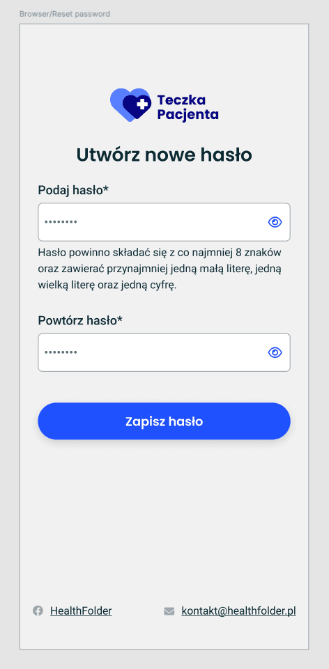 |
Here’s what each one produced:
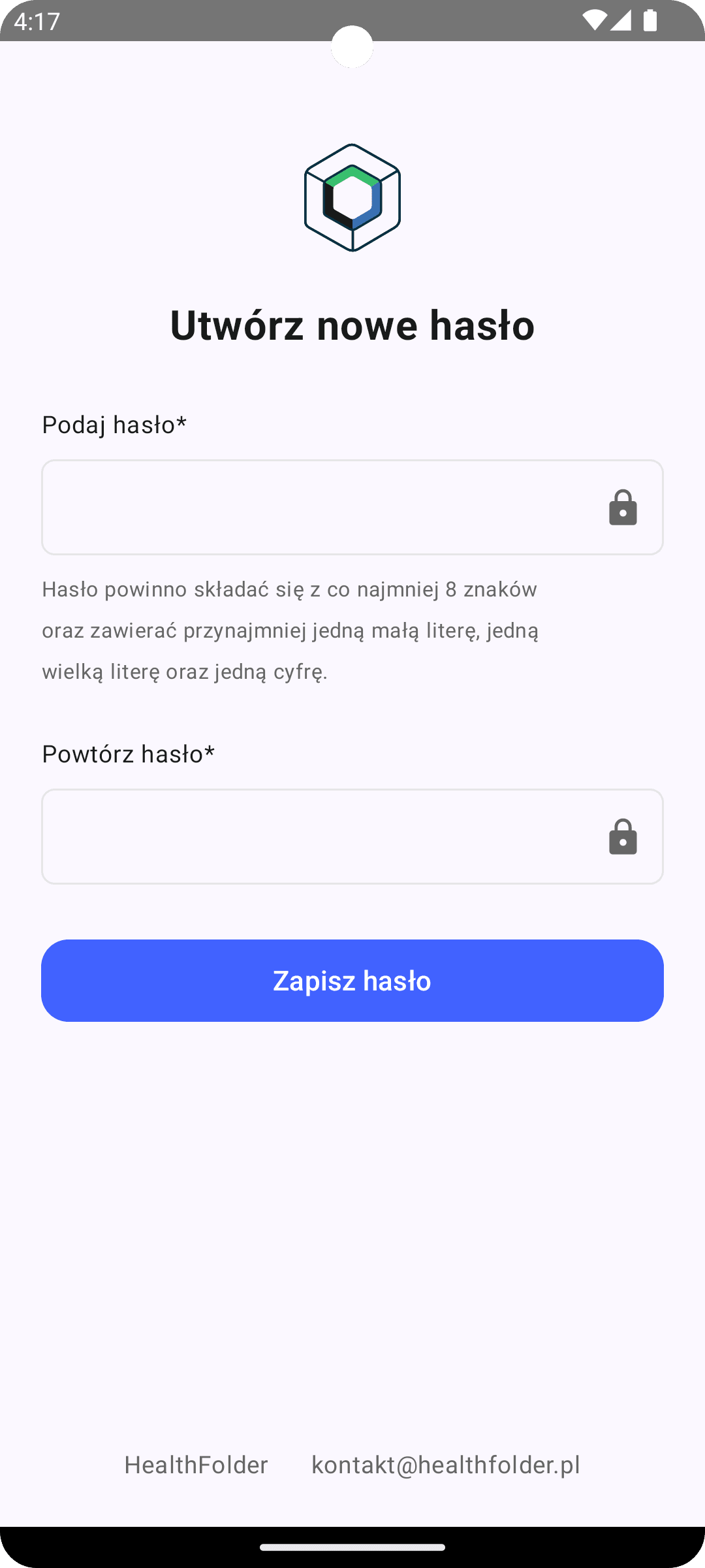 | Claude 3.5 Sonnet✅ Strengths:
⚠️ Areas for Improvement:
|
Generated code snippet by Claude 3.5 Sonnet
import androidx.compose.foundation.Image
import androidx.compose.foundation.layout.*
import androidx.compose.material.icons.Icons
import androidx.compose.material.icons.filled.Visibility
import androidx.compose.material3.*
import androidx.compose.runtime.*
import androidx.compose.ui.Alignment
import androidx.compose.ui.Modifier
import androidx.compose.ui.graphics.Color
import androidx.compose.ui.res.painterResource
import androidx.compose.ui.text.font.FontWeight
import androidx.compose.ui.text.style.TextAlign
import androidx.compose.ui.unit.dp
import androidx.compose.ui.unit.sp

/**
 * Main password reset screen composable
 * Implements the complete reset password UI following the provided design
 */
@Composable
fun PasswordResetScreen(
    modifier: Modifier = Modifier
) {
    Column(
        modifier = modifier
            .fillMaxSize()
            .padding(horizontal = 24.dp),
        horizontalAlignment = Alignment.CenterHorizontally
    ) {
        Spacer(modifier = Modifier.height(48.dp))

        // Logo placeholder
        Box(
            modifier = Modifier.size(80.dp),
            contentAlignment = Alignment.Center
        ) {
            // Replace with actual logo resource
            Image(
                painter = painterResource(id = R.drawable.placeholder_logo),
                contentDescription = "Teczka Pacjenta Logo",
                modifier = Modifier.size(80.dp)
            )
        }

        Spacer(modifier = Modifier.height(24.dp))

        Text(
            text = "Utwórz nowe hasło",
            fontSize = 24.sp,
            fontWeight = FontWeight.Bold,
            color = Color(0xFF1A1A1A)
        )

        Spacer(modifier = Modifier.height(32.dp))

        PasswordInput(
            label = "Podaj hasło*",
            hint = "Hasło powinno składać się z co najmniej 8 znaków\n" +
                   "oraz zawierać przynajmniej jedną małą literę, jedną\n" +
                   "wielką literę oraz jedną cyfrę."
        )

        Spacer(modifier = Modifier.height(24.dp))

        PasswordInput(
            label = "Powtórz hasło*"
        )

        Spacer(modifier = Modifier.height(32.dp))

        Button(
            onClick = { },
            modifier = Modifier
                .fillMaxWidth()
                .height(48.dp),
            colors = ButtonDefaults.buttonColors(
                containerColor = Color(0xFF4162FF)
            ),
            shape = MaterialTheme.shapes.medium
        ) {
            Text(
                text = "Zapisz hasło",
                color = Color.White,
                fontSize = 16.sp
            )
        }

        Spacer(modifier = Modifier.weight(1f))

        // Footer
        Row(
            modifier = Modifier
                .fillMaxWidth()
                .padding(bottom = 24.dp),
            horizontalArrangement = Arrangement.Center,
            verticalAlignment = Alignment.CenterVertically
        ) {
            Text(
                text = "HealthFolder",
                color = Color(0xFF666666),
                fontSize = 14.sp
            )

            Spacer(modifier = Modifier.width(24.dp))

            Text(
                text = "[email protected]",
                color = Color(0xFF666666),
                fontSize = 14.sp
            )
        }
    }
}

/**
 * Custom password input field with visibility toggle
 */
@Composable
private fun PasswordInput(
    label: String,
    hint: String? = null,
    modifier: Modifier = Modifier
) {
    Column(modifier = modifier.fillMaxWidth()) {
        Text(
            text = label,
            fontSize = 14.sp,
            color = Color(0xFF1A1A1A),
            modifier = Modifier.padding(bottom = 8.dp)
        )

        OutlinedTextField(
            value = "",
            onValueChange = { },
            modifier = Modifier.fillMaxWidth(),
            trailingIcon = {
                IconButton(onClick = { }) {
                    Icon(
                        imageVector = Icons.Default.Visibility,
                        contentDescription = "Toggle password visibility",
                        tint = Color(0xFF666666)
                    )
                }
            },
            colors = OutlinedTextFieldDefaults.colors(
                unfocusedBorderColor = Color(0xFFE5E5E5),
                focusedBorderColor = Color(0xFF4162FF)
            ),
            shape = MaterialTheme.shapes.small
        )

        if (hint != null) {
            Text(
                text = hint,
                fontSize = 12.sp,
                color = Color(0xFF666666),
                modifier = Modifier.padding(top = 8.dp)
            )
        }
    }
}
ChatGPT-4o✅ Strengths:
⚠️ Areas for Improvement:
| 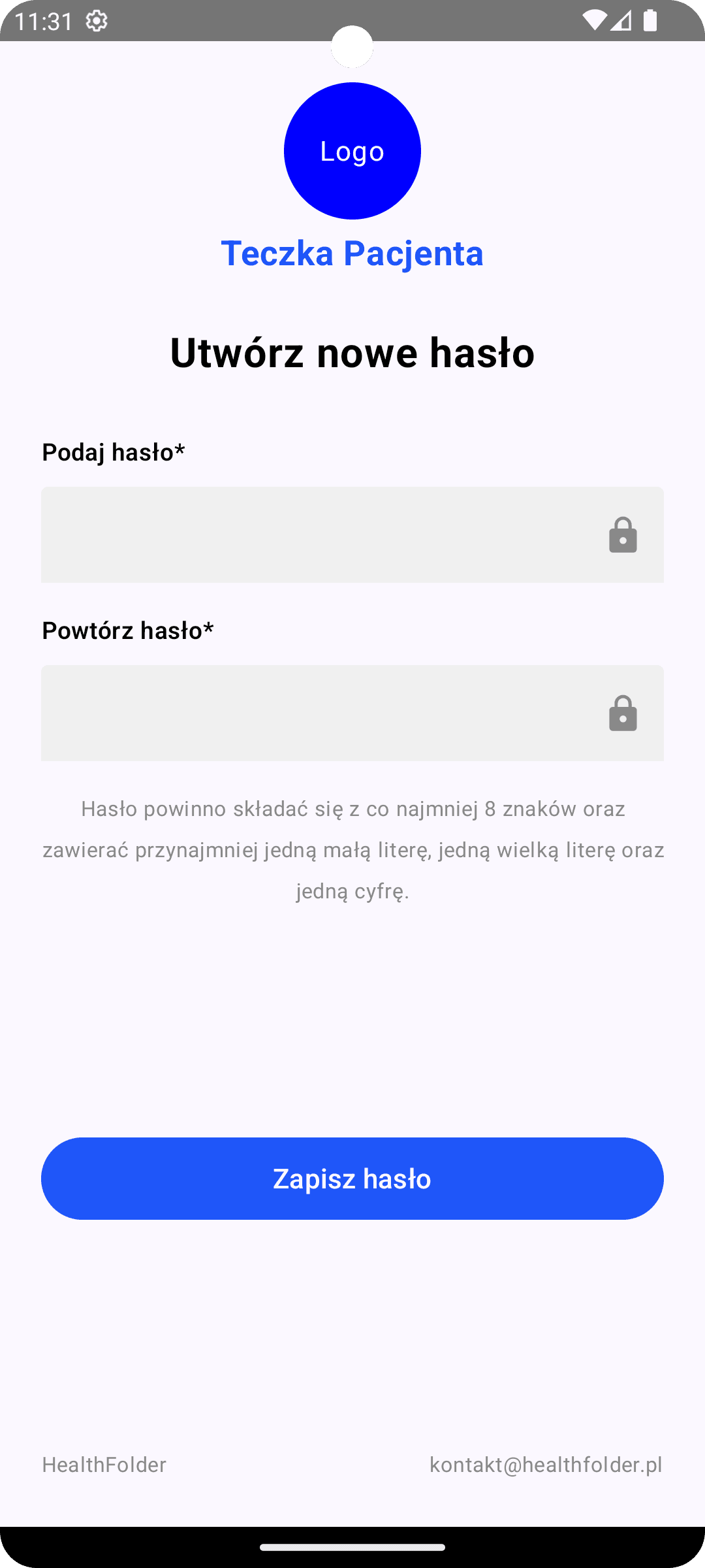 |
Generated code snippet by ChatGPT-4o
import androidx.compose.foundation.background
import androidx.compose.foundation.layout.*
import androidx.compose.foundation.shape.CircleShape
import androidx.compose.foundation.text.BasicTextField
import androidx.compose.material3.*
import androidx.compose.material3.icons.Icons
import androidx.compose.material3.icons.filled.Visibility
import androidx.compose.material3.icons.filled.VisibilityOff
import androidx.compose.runtime.*
import androidx.compose.ui.Alignment
import androidx.compose.ui.Modifier
import androidx.compose.ui.graphics.Color
import androidx.compose.ui.text.font.FontWeight
import androidx.compose.ui.unit.dp
import androidx.compose.ui.unit.sp
import androidx.compose.ui.graphics.Shape
import androidx.compose.ui.text.input.PasswordVisualTransformation
import androidx.compose.ui.text.input.VisualTransformation
import androidx.compose.ui.text.style.TextAlign
import androidx.compose.ui.tooling.preview.Preview

@Composable
fun ResetPasswordScreen() {
    Column(
        modifier = Modifier
            .fillMaxSize()
            .padding(24.dp),
        horizontalAlignment = Alignment.CenterHorizontally,
        verticalArrangement = Arrangement.SpaceBetween
    ) {
        // Header with logo and title
        Column(
            modifier = Modifier
                .fillMaxWidth(),
            horizontalAlignment = Alignment.CenterHorizontally
        ) {
            // Placeholder for logo
            Box(
                modifier = Modifier
                    .size(80.dp)
                    .background(Color.Blue, shape = CircleShape),
                contentAlignment = Alignment.Center
            ) {
                // Logo icon placeholder
                Text("Logo", color = Color.White)
            }

            Spacer(modifier = Modifier.height(8.dp))

            // Logo Text
            Text(
                text = "Teczka Pacjenta",
                fontWeight = FontWeight.Bold,
                fontSize = 20.sp,
                color = Color(0xFF1F56F9)
            )

            Spacer(modifier = Modifier.height(32.dp))

            // Title
            Text(
                text = "Utwórz nowe hasło",
                fontWeight = FontWeight.Bold,
                fontSize = 24.sp,
                color = Color.Black
            )

            Spacer(modifier = Modifier.height(32.dp))

            // Password input fields
            PasswordField(label = "Podaj hasło*")
            Spacer(modifier = Modifier.height(16.dp))
            PasswordField(label = "Powtórz hasło*")

            Spacer(modifier = Modifier.height(16.dp))

            // Info text about password requirements
            Text(
                text = "Hasło powinno składać się z co najmniej 8 znaków oraz zawierać przynajmniej jedną małą literę, jedną wielką literę oraz jedną cyfrę.",
                fontSize = 12.sp,
                color = Color.Gray,
                textAlign = TextAlign.Center
            )
        }

        // Save button
        Button(
            onClick = { /* Save password action */ },
            modifier = Modifier
                .fillMaxWidth()
                .height(48.dp),
            colors = ButtonDefaults.buttonColors(
                containerColor = Color(0xFF1F56F9)
            )
        ) {
            Text(
                text = "Zapisz hasło",
                fontSize = 16.sp,
                color = Color.White
            )
        }

        // Footer with icons and contact info
        Row(
            modifier = Modifier.fillMaxWidth(),
            horizontalArrangement = Arrangement.SpaceBetween,
            verticalAlignment = Alignment.CenterVertically
        ) {
            Text(
                text = "HealthFolder",
                fontSize = 12.sp,
                color = Color.Gray
            )
            Text(
                text = "[email protected]",
                fontSize = 12.sp,
                color = Color.Gray
            )
        }
    }
}

@Composable
fun PasswordField(label: String) {
    var password by remember { mutableStateOf("") }
    var passwordVisible by remember { mutableStateOf(false) }

    Column {
        Text(
            text = label,
            fontWeight = FontWeight.SemiBold,
            fontSize = 14.sp,
            color = Color.Black
        )
        Spacer(modifier = Modifier.height(8.dp))

        TextField(
            value = password,
            onValueChange = { password = it },
            visualTransformation = if (passwordVisible) VisualTransformation.None else PasswordVisualTransformation(),
            trailingIcon = {
                val image = if (passwordVisible)
                    Icons.Filled.Visibility
                else Icons.Filled.VisibilityOff

                IconButton(onClick = { passwordVisible = !passwordVisible }) {
                    Icon(imageVector = image, contentDescription = null, tint = Color.Gray)
                }
            },
            colors = TextFieldDefaults.textFieldColors(
                containerColor = Color(0xFFF0F0F0),
                focusedIndicatorColor = Color.Transparent,
                unfocusedIndicatorColor = Color.Transparent
            ),
            modifier = Modifier
                .fillMaxWidth()
                .height(56.dp)
        )
    }
}

@Preview(showBackground = true)
@Composable
fun PreviewResetPasswordScreen() {
    ResetPasswordScreen()
}
🚫 o1-preview, unfortunately, does not support attachments yet
Time-Saving Metrics
Let’s add a comparison table highlighting the time savings:
| Task | Traditional Approach | AI-Assisted (1st Try) |
|---|---|---|
| Basic Layout | ~ 30 min | 1 min |
| Documentation | ~ 5 min | 0 min |
| Total | ~ 35 min | 1 min |
General observations
State Management
- Generated code often lacks proper state handling
- Lifecycle considerations are frequently missing
- Complex state patterns need manual implementation
Error Handling
- Basic error states are often overlooked
- Input validation logic needs refinement
- Edge cases require manual testing and handling
Image Assets
- AI can’t generate actual images
- Resource management needs manual setup
- Image-related code requires adaptation
Extras: Advanced AI-Assisted UI Development Techniques
Component-by-Component Approach: Laser-Focused UI Generation 🔍
Sometimes, tackling the entire screen at once isn’t optimal. Let’s explore a more surgical approach – focusing the AI on individual components.
The Technique
Instead of sending the entire design, crop your screenshot to isolate specific components. This yields several benefits:
- Higher accuracy for complex components
- More detailed implementation suggestions
- Better handling of edge cases
- Reusable components that match your design system
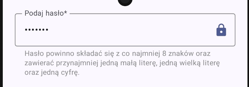
Example: Custom Password Field
Let’s see this in action with our password input field:
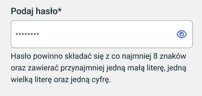 |  |
Generated code snippet by Claude 3.5 Sonnet
import androidx.compose.foundation.layout.*
import androidx.compose.foundation.text.KeyboardOptions
import androidx.compose.material3.*
import androidx.compose.runtime.*
import androidx.compose.ui.Modifier
import androidx.compose.ui.graphics.Color
import androidx.compose.ui.res.painterResource
import androidx.compose.ui.text.input.KeyboardType
import androidx.compose.ui.text.input.PasswordVisualTransformation
import androidx.compose.ui.text.input.VisualTransformation
import androidx.compose.ui.unit.dp
import androidx.compose.ui.unit.sp

/**
 * Password input field component matching the provided design.
 * Features:
 * - Password visibility toggle
 * - Helper text with password requirements
 * - Error state handling
 * - Material 3 styling
 */
@Composable
fun PasswordInputField(
    label: String,
    value: String,
    onValueChange: (String) -> Unit,
    modifier: Modifier = Modifier,
    isError: Boolean = false
) {
    var passwordVisible by remember { mutableStateOf(false) }

    Column(
        modifier = modifier.fillMaxWidth(),
        verticalArrangement = Arrangement.spacedBy(4.dp)
    ) {
        // Password TextField with visibility toggle
        OutlinedTextField(
            value = value,
            onValueChange = onValueChange,
            label = { Text(label) },
            modifier = Modifier.fillMaxWidth(),
            visualTransformation = if (passwordVisible)
                VisualTransformation.None
            else
                PasswordVisualTransformation(),
            keyboardOptions = KeyboardOptions(
                keyboardType = KeyboardType.Password
            ),
            trailingIcon = {
                IconButton(onClick = { passwordVisible = !passwordVisible }) {
                    Icon(
                        painter = if (passwordVisible)
                            painterResource(id = android.R.drawable.ic_menu_view)
                        else
                            painterResource(id = android.R.drawable.ic_menu_view),
                        contentDescription = if (passwordVisible)
                            "Hide password"
                        else
                            "Show password",
                        tint = MaterialTheme.colorScheme.primary
                    )
                }
            },
            colors = OutlinedTextFieldDefaults.colors(
                focusedBorderColor = MaterialTheme.colorScheme.primary,
                unfocusedBorderColor = Color.Gray,
                errorBorderColor = MaterialTheme.colorScheme.error,
            ),
            isError = isError,
            singleLine = true
        )

        // Password requirements helper text
        Text(
            text = "Hasło powinno składać się z co najmniej 8 znaków oraz zawierać przynajmniej jedną małą literę, jedną wielką literę oraz jedną cyfrę.",
            color = if (isError)
                MaterialTheme.colorScheme.error
            else
                Color.Gray,
            style = MaterialTheme.typography.bodySmall,
            modifier = Modifier.padding(start = 16.dp)
        )
    }
}

/**
 * Preview and usage example of the PasswordInputField
 */
@Composable
fun PasswordInputPreview() {
    var password by remember { mutableStateOf("") }

    MaterialTheme {
        Surface {
            PasswordInputField(
                label = "Podaj hasło*",
                value = password,
                onValueChange = { password = it },
                modifier = Modifier.padding(16.dp)
            )
        }
    }
}
Conclusion
This AI-assisted approach to UI development isn’t just about speed – it’s about transforming our development workflow. Here’s what we’ve achieved:
- Speed Without Sacrifice
- 80% accuracy in first generation
- Only 1-2 minutes from mockup to code
- Clean, maintainable code structure
- Practical Benefits
- Faster prototyping iterations
- More time for complex features
- Consistent code style
- Built-in documentation
- Best Practices
- Use focused, component-level prompts
- Always review and test generated code
- Keep your design tokens consistent
- Maintain a prompt template library
- Looking Forward
- AI tools are rapidly improving
- Potential for even higher accuracy
- Integration with design tools coming soon
Remember: The goal isn’t to replace developers, but to supercharge their workflow. With these tools, we can focus more on architecture, user experience, and business logic while letting AI handle the pixel-perfect implementations.